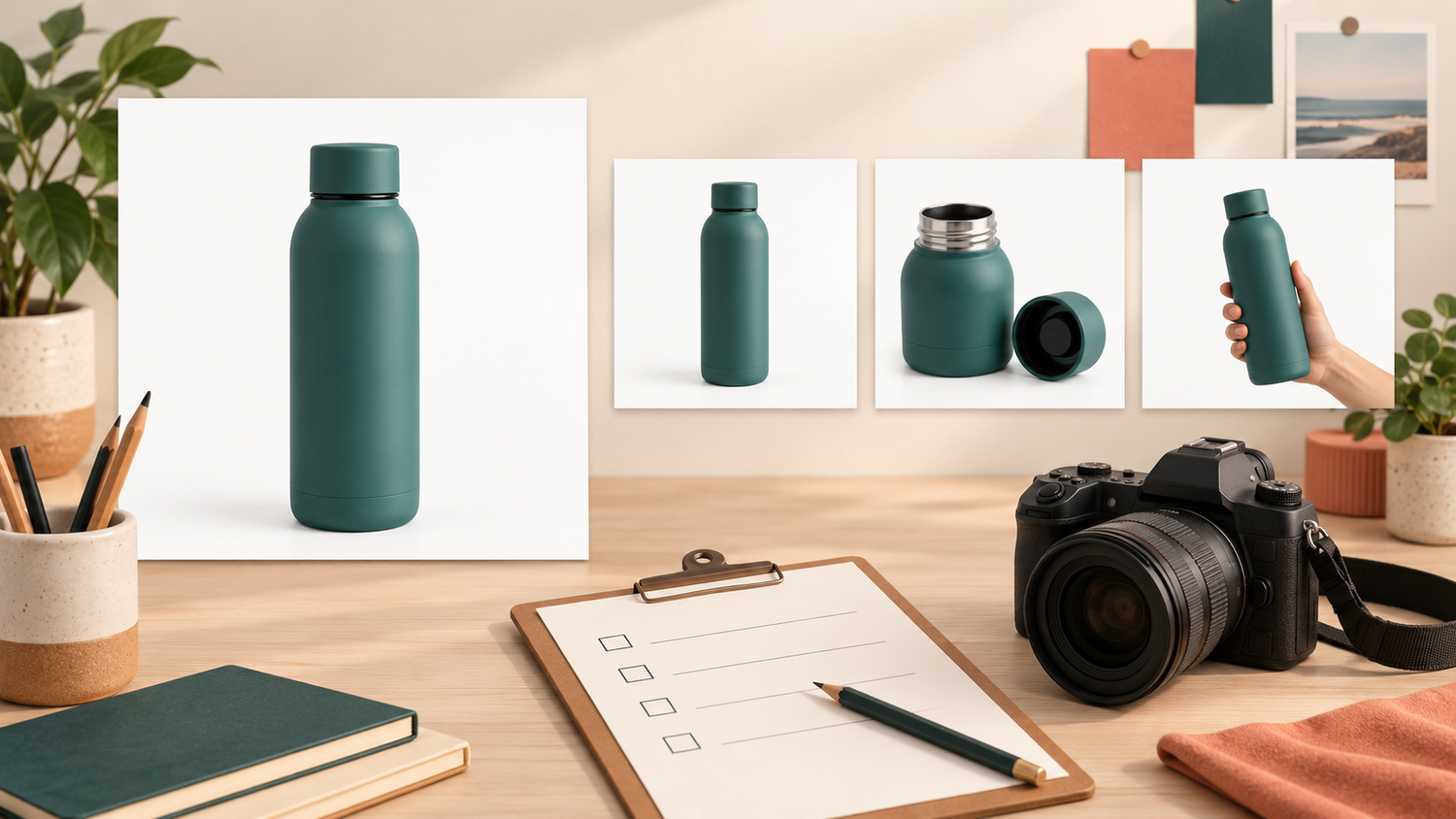

Monochrome Product Alternates: Keep Them Separate from Variant-Selection Photos
You are preparing a black-and-white image for a brand story, while the product page still needs a photograph that explains the item’s colour. Both can be useful, but they do different jobs. When discussing monochrome product alternates and colour variants, start with two questions: where will this image appear, and what information must remain visible?
Here, monochrome means a black-and-white alternate. The task is not to choose the most striking effect. It is to keep a creative version separate from the image that helps someone choose an item. You do not have to discard either version; you need to make its purpose clear to the person receiving it.
Daftar Isi
Monochrome product alternates and colour variants: what changes?
Imagine a hypothetical pair of cups with similar shapes: one terracotta, the other teal. In a colour photograph, hue helps explain the choice. In black and white, that cue is no longer present as colour, even if a difference in lightness remains. Do not assume that both cups must turn into exactly the same grey.

The colour named in an option menu needs to be checked against the image shown with it. If someone selects teal and sees only a black-and-white photograph, the image does not explain that colour in the same way as the colour version. Adding contrast does not restore the hue information intentionally removed.
Adobe offers a Black & White adjustment for grayscale conversion, with controls for the grey tones derived from particular colours.[1] That establishes that a black-and-white alternate can be adjusted, not that every result suits every destination. Keep the permitted colour photograph as a separate source rather than overwriting it once the creative version is approved.
Give the brand story and the product choice different images
You might consider the black-and-white version for a brand-story placement whose job is not to distinguish colour options. Specify the location, such as one editorial section of your website. For the product-selection area, retain a colour image that matches the item and variant being described. This is advice about routing images, not a universal prohibition on creative black and white.
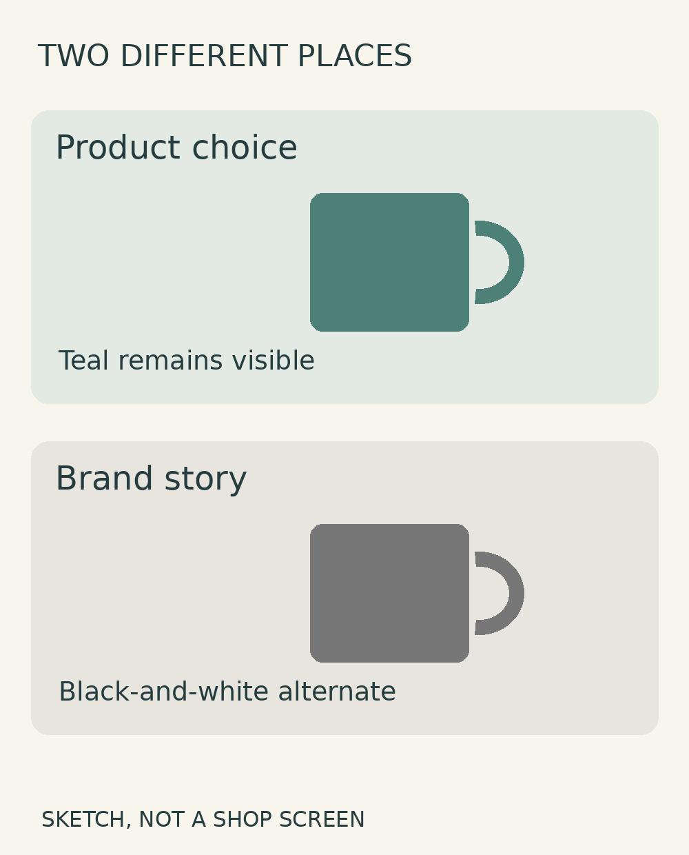
Some destinations have more specific requirements. In its Google Merchant Center image guidance, Google asks for imagery that matches the exact variant, including its colour, pattern, finish and material. For products with several colours or styles, it also specifies one variant per image.[2] The two-cup illustration in this guide is therefore not a ready-to-upload Merchant Center main listing image.
If you are using another destination, check its own requirements. Approval for a brand-story image does not automatically establish approval for an advertisement or product listing. A brief can identify two placements without assuming they need identical image content or technical specifications.
Hand over the pair with a purpose people can understand
For one hypothetical teal cup, two short descriptions could be enough: “teal colour — variant description” and “black and white — brand story”. These are communication examples, not an SCI naming standard. Use terms that make sense to the person placing the images, so the intention does not depend on remembering an earlier conversation.
Identify the source file, the approved version and its intended placement. If approval covers only the creative alternate, say so. Calling both files “final” leaves the recipient guessing which destination each one is final for. A brief purpose label answers a different question from a revision number.
You do not need a catalogue-wide naming system for two images. A short message naming the product, colour, file and purpose can be more useful than a long set of codes nobody has agreed. If someone else manages the website or shop, send that context with the files, not just a download link.
Check the placed image, not just the delivery folder
Open the actual page or preview that will be used. Select the intended colour option, look at the image displayed, and compare it with the approved colour file. Repeat for other available options. Do not stop because the first thumbnail looks right: the image associated with the next choice may be different.
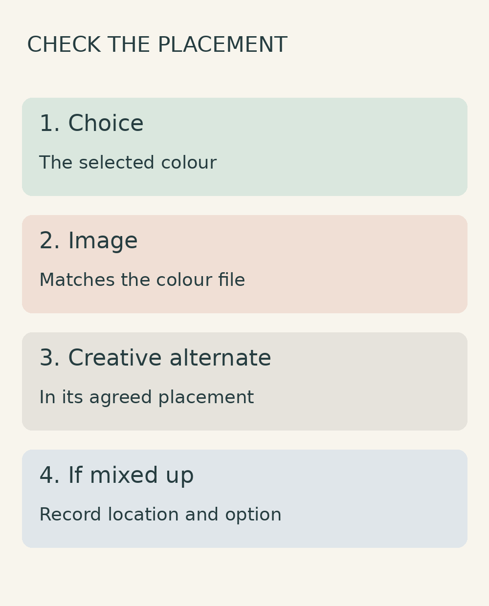
Check where the black-and-white alternate has landed as well. Is it in the agreed creative placement, or has it replaced the descriptive product image? If the versions are mixed up, record the page location, selected option and displayed image. The person authorised to manage that page can then investigate the mapping without having to interpret a vague report that “the colour is wrong”.
This check does not guarantee platform approval or a sales result. Its practical purpose is to carry the handoff beyond the edited file and confirm that the intended image appears in the intended context. A correct delivery folder alone cannot show what a visitor will see after choosing a different product option.
To discuss an online photo editing service, bring a colour source you have permission to use, the intended placement and the product information that must remain clear. Shaniba Creative Industry offers online photo transfer and review.[3] Use the SCI consultation hub to confirm the scope before commissioning. Do not assume additional versions or shop-page administration are included.
References
[1] Adobe: convert a colour image to black and white. [2] Google Merchant Center: image_link and variant imagery. [3] Shaniba Creative Industry photo editing service.
Share this post to: