Moiré in Patterned Product Photos: Why Do Imaginary Waves Appear?
Moiré in product photos can make a finely checked pouch appear to have broad waves or rainbow colours that are not on the item itself. For a business selling patterned products, this is more than an unattractive photograph: customers need to see the pattern the product actually has. Asking for the whole fabric to be smoothed may remove the very detail you want to show.
Start with a simple question: are the waves on the sample, in the supplied source image, or only in a particular display? The answer helps you make a more useful request to the photographer, editor, or website manager. The aim is not to turn patterned material into a plain surface, but to preserve the real pattern while assessing the interference.
Daftar Isi
Recognize moiré in product photos before changing the fabric
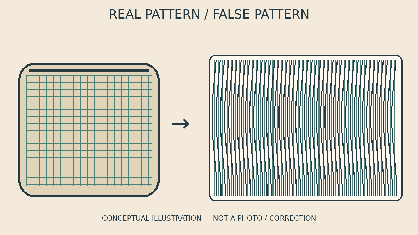
Moiré is an additional pattern created when two patterns overlap. In Nikon’s explanation of moiré and false colour, the subject supplies one pattern and the sensor another, producing a third pattern in the photograph. Fine repetitive subjects, including woven textiles, are more likely to show the effect. An apparent pattern in the image therefore does not automatically mean the physical product is defective.
False colour is another distinction worth making. Nikon explains that it can appear with moiré or on its own. Not every colour difference or wave on fabric should immediately be diagnosed as moiré. A fold, a shadow, coloured thread, and a genuine printed pattern are different features and need to be considered separately.
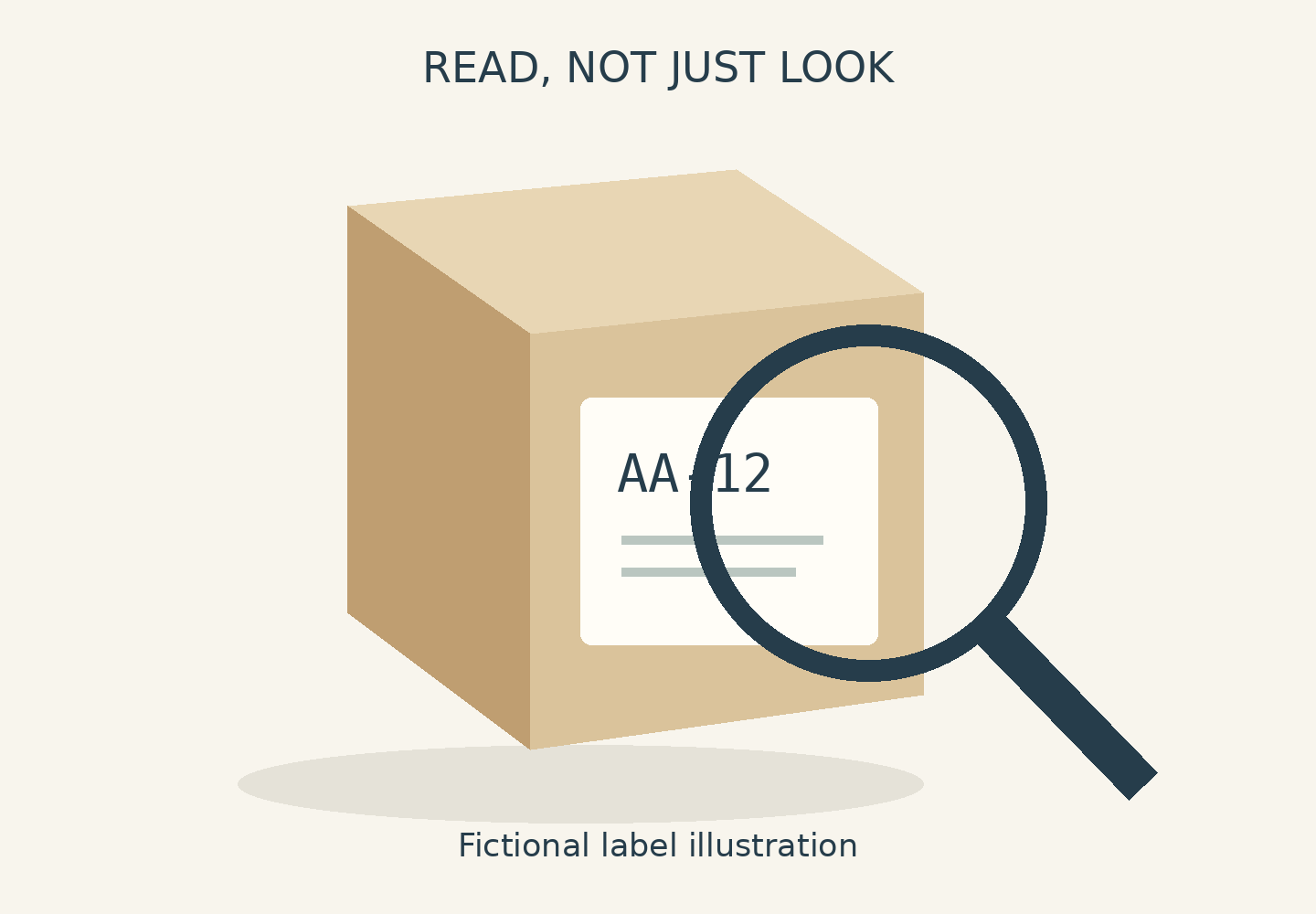
Imagine a hypothetical pouch with small blue-and-white checks. Its photograph shows purple curves across the front, but the sample does not. Identify those curves rather than asking someone to “make the fabric smooth”. A reference for the actual pattern helps the editor understand what must remain. The illustrations in this guide are conceptual, not photographs of a sample or evidence of a successful correction.
Separate the source file from later displays
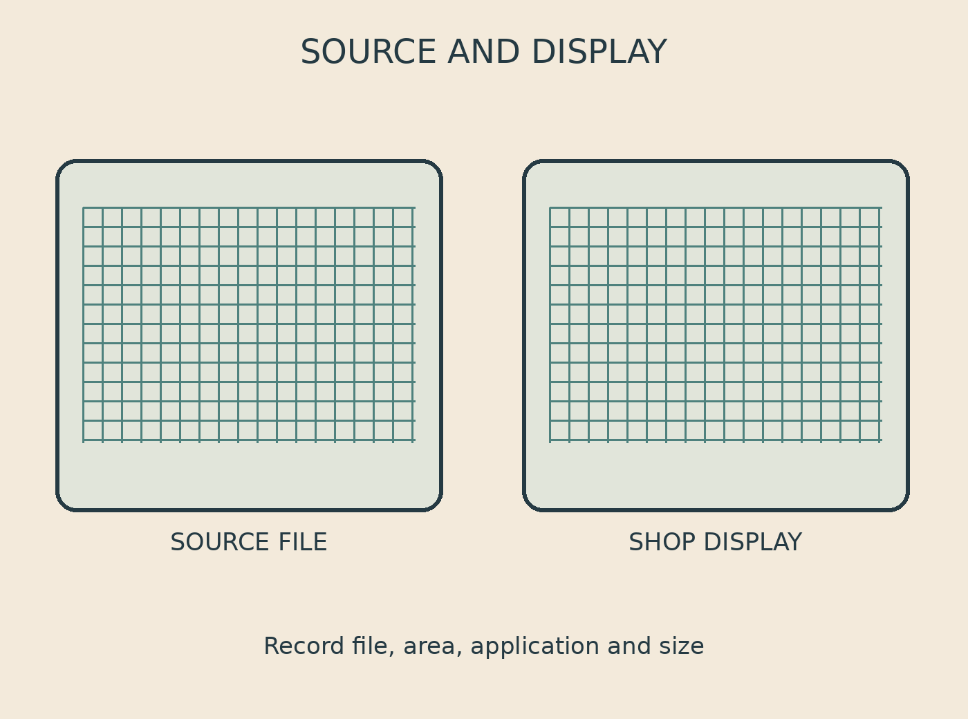
Keep the supplied source and record which version shows the interference. Compare the same photograph in an image viewer and in its intended final location. Note the filename, affected area, application or page, and display size. This keeps the conversation focused on one image rather than two different exports with similar names.
Nikon recommends examining an image at 100 percent magnification on a computer screen to identify artefacts that may be difficult to see on a camera LCD. Use this as one detailed check, then look at the actual intended display size as well. A catalogue image on a phone serves a different viewing situation from a small detail enlarged across a monitor. Neither view alone answers every question about the final use.
If the waves are absent from the supplied source but visible on the shop page, do not automatically ask for that source to be retouched. Show both views to whoever manages the output and ask them to investigate. The difference does not by itself prove that resizing, compression, or a particular screen caused it. A screenshot can locate the problem, but provide the source file too, rather than asking an editor to work only from a screenshot.
Discuss a local correction or another capture
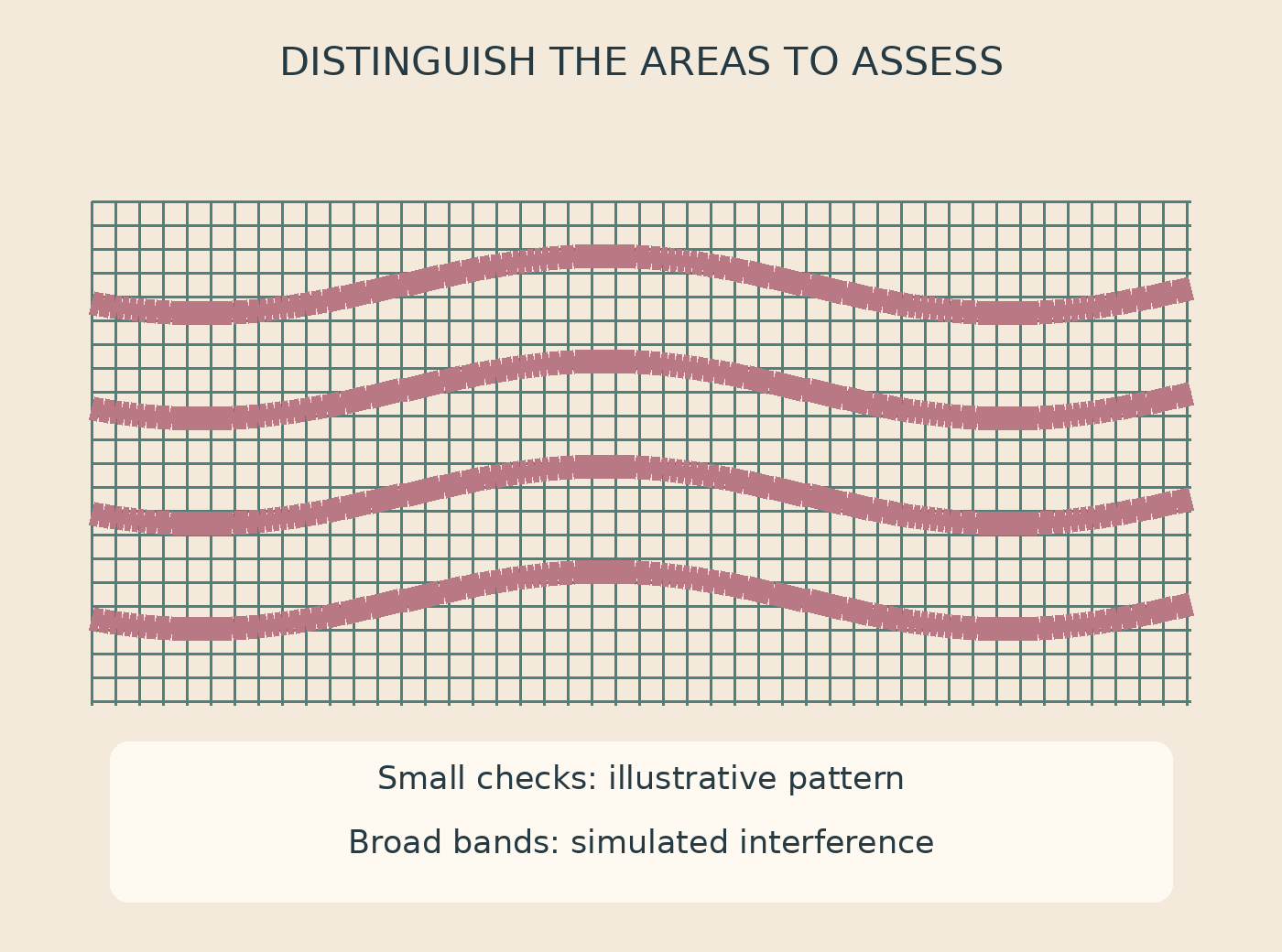
Treat correction as a limited test on the available file. Adobe’s Camera Raw documentation lists a Moiré Reduction control among its local adjustments. This establishes that a tool is available, not that every pattern can be restored or that all the original detail survives in the photograph.
Ask for an assessment of one area first. Does the false colour decrease? Are the broad waves still visible? Have the genuine pattern lines become weaker? Those separate questions are more useful than “remove everything”. A cleaner-looking result may still be unsuitable for a catalogue if the weave now resembles a smooth plastic surface.
If a correction cannot preserve enough of the real pattern, discuss another capture with the photographer. Nikon’s historical explanation considers changes in the camera–subject relationship and capture settings using particular camera examples. It is not a universal recipe, nor a reason to blur an entire product. The photographer needs to assess suitable changes while keeping the shape, detail, and purpose of your image in view.
Keep the real pattern in the final image
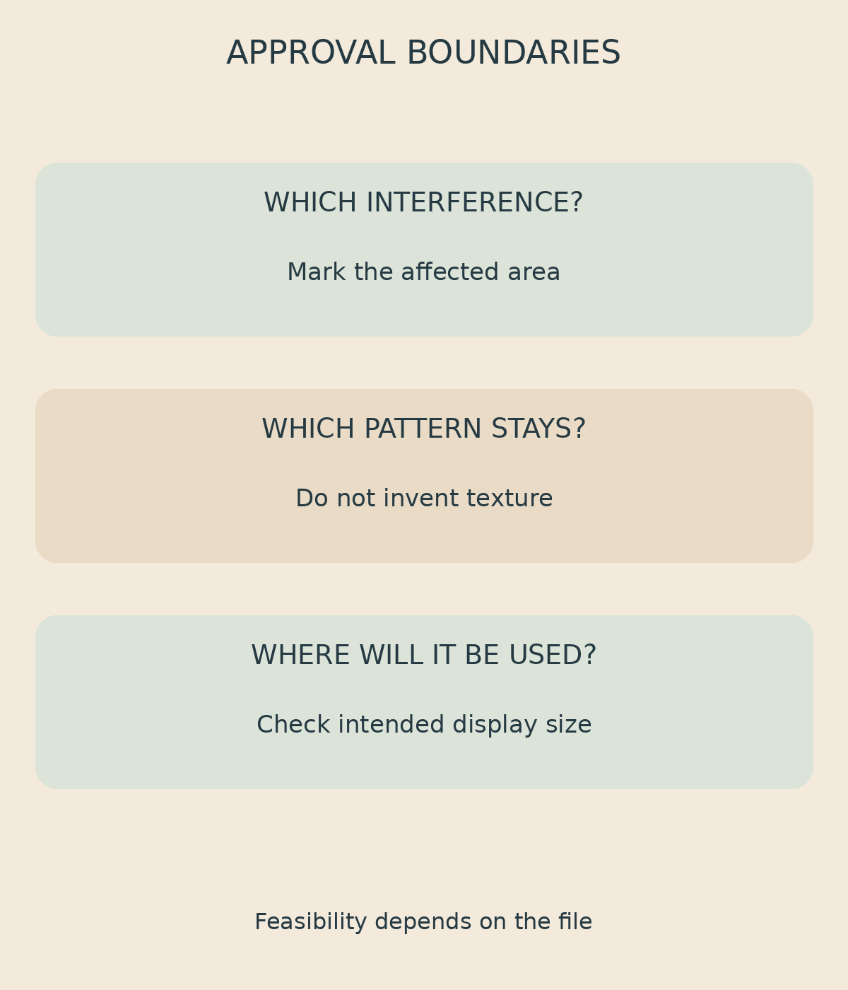
Before approving a result, agree on three boundaries: which interference should be reduced, which pattern must remain, and where the photograph will be used. For the hypothetical pouch, a request might say: “Please assess the purple curves on the front panel. Keep the blue-and-white checks and seam shape. Tell me if correction removes the check lines.” This is an example of an instruction, not a promise that the file can be repaired.
Review both the marked area and the whole product, then check the result at its intended display size. Do not approve invented texture as a replacement simply because the interference has disappeared. If a physical reference is unavailable or some detail cannot be distinguished, make that limitation clear before treating the result as a product reference.
For an online photo editing service, discuss the image with Shaniba Creative Industry. Provide the source, a pattern reference you have permission to use, the affected area, and the intended output. Correction feasibility, scope, cost, and whether another capture is worth considering depend on the actual file—not the name of a software control or a conceptual illustration.
Share this post to: